 Click here for all posts in the Brand Experience Project.
Click here to read last year’s frustrated post about trying to renew my membership to AAA.
It is that time again, and I went online to try and renew my membership to AAA. In addition, it occurred to me that my husband Will isn’t on the plan, so he would need to be added. Let’s try this again!
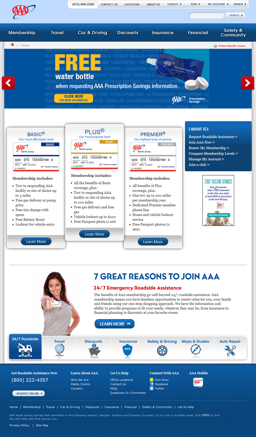 They have updated their homepage, and it does look much more modern than last year. I am noticing the MUCH smaller social callouts, which I don’t understand at all. Why hide them?
I click the handy “renew” button in the upper right corner. There are a LOT more options at the top there, last year it was “login” and “my account.”
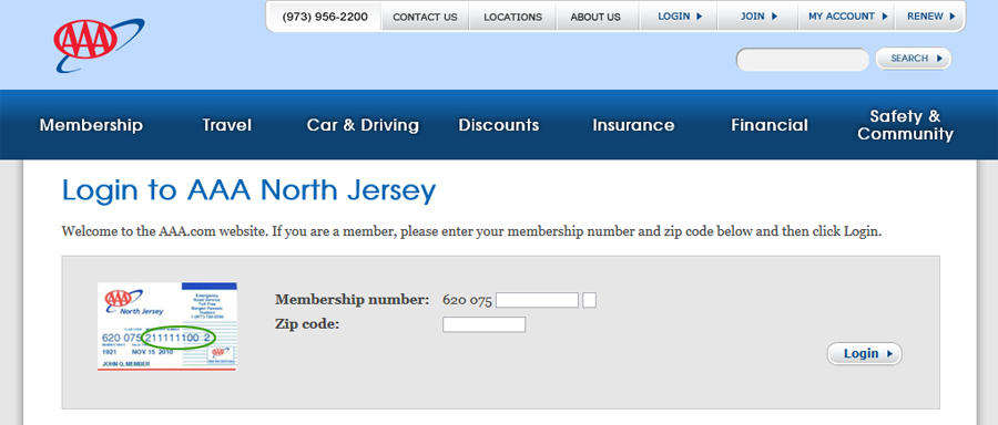 Hmm. This is the exact same page as last year, which suggests that the homepage update was only that. A homepage update.
I successfully enter my info and click “login.”
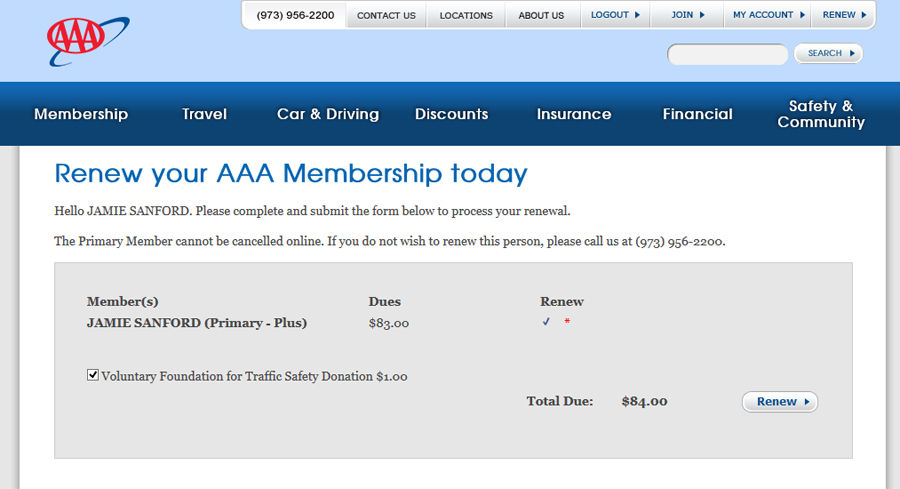 And here we go again.
- There is no way here to change the plan I have, either to upgrade or downgrade.
- There is no option to add another person.
I know I said “renew,” but this is ridiculous. This design is awful.
I decide to click “renew” and see what happens.
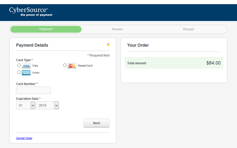 Seriously? I am sent to a different website to have my payment processed, and the page I am on says absolutely nothing about what I am purchasing for $84.

How can this be their system?!? This is a major service in the US, and one with limited competition (I know many car companies offer roadside assistance, but as far as I can tell, AAA doesn’t have any major competition offering the services they do.)
 I clicked the cancel button. I am so, so irritated with this system. I decide to click around and see if there’s a way for me to do this another way.
I decide to go to “join” instead.
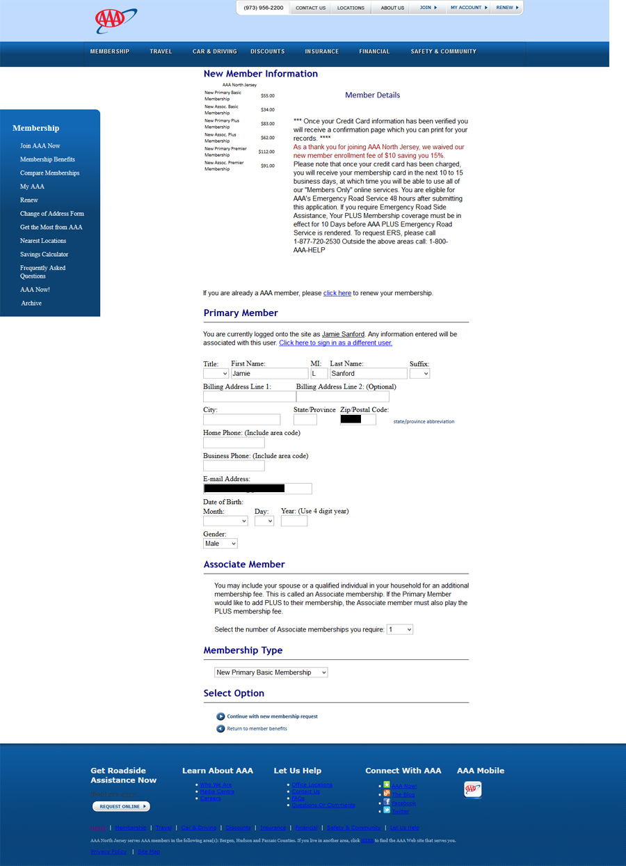 This page is the same as the one I looked at last year. It is still terrible. The footer looks different, but they have chosen a heinous blue font that is completely unreadable on a blue background. Come on.
I go ahead and fill in my information and indicate that I want to add another person.
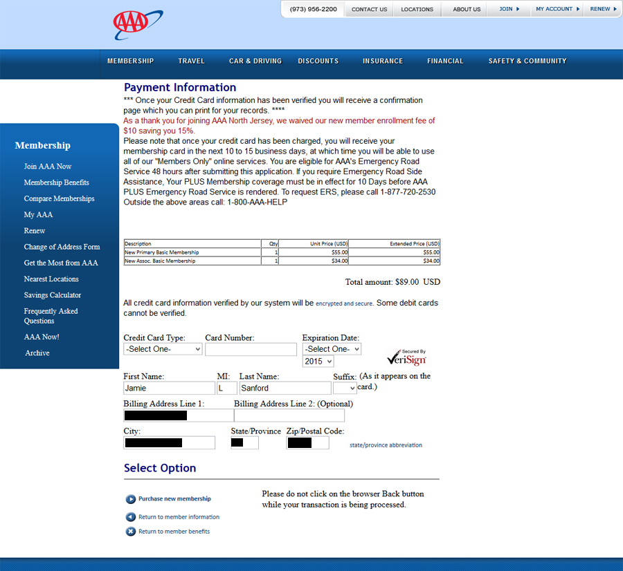 I skipped a screenshot of the previous page, where I had to enter my husband’s name and birthday. This page is an improvement over the renewal payment page, at least I’m still in the realm of AAA here. What I don’t understand is why the words “encrypted and secure” are in a tiny font (is it a secret?), and I click to read what it says, hoping for a pop-up box, since I certainly don’t want to leave the page where I might have entered my personal information. I am, not surprisingly, disappointed, since the link opens another page, in the same tab.
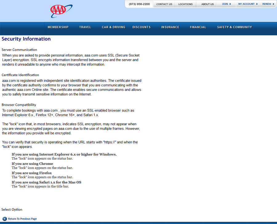 Why. Why is this not information that could be in a pop-up box?
While we are at it, the AAA website is also in desperate need of a copy editor. The “certificate identification” isn’t clear, and the word “online” is randomly capitalized, and why mention the site identification authorities and not just name the ones you use?
I closed my browser window after this. I am undecided on renewing my membership.


