 Click here for all posts in the Brand Experience Project.
I recently bought a new car, after having to call AAA twice in one week to rescue me in my old one. It was just after getting my new car that I had to renew my AAA membership. I’ve had it as long as I’ve had a car, and it really is the best thing. I have been towed at least twice, and jumpstarted maybe 10 times? Things happen, it’s good to have roadside assistance.
Anyway, I decided to renew my membership online, and that’s where things went downhill.
 Pretty straightforward. I’m in North Jersey, this is the North Jersey section of AAA.com. This could be a bit more modern, but perhaps it is working for them. Change for the sake of change isn’t necessary, but a bit of an update on the look would not hurt the site.
 I choose the “login” option as I’ve been here before. Again, easy enough instructions for me to get to my account.
 Instead of my account, I’m back to a general page. Hmm.
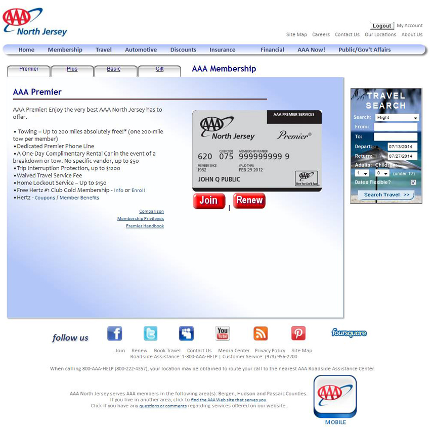 I move to the membership area to review my options. Oy. This really needs to be presented in a better way! A direct comparison of all options on one page would be better. Or perhaps a chart showing each option, how much it costs, and the features it has checked off. We’ve all seen a version of this.
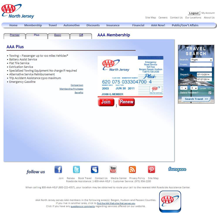 You can see all of the tabs are similar.
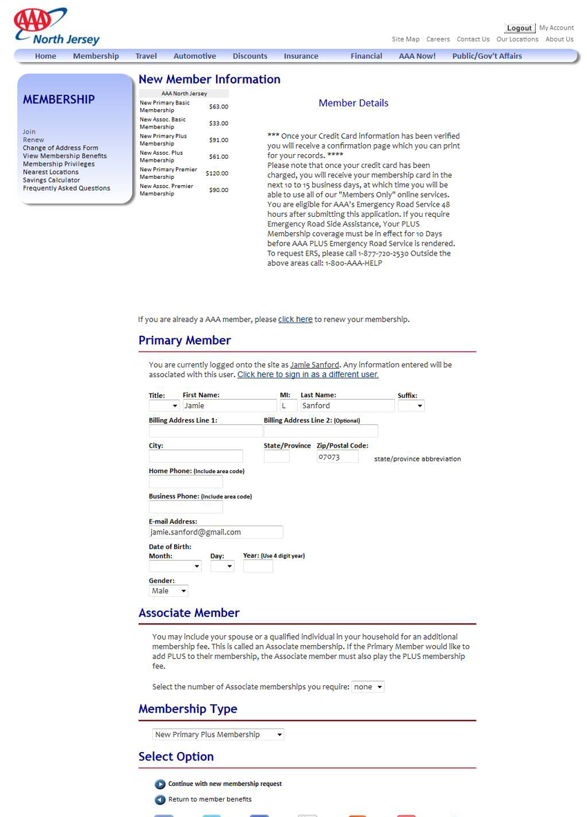 This is where I got when I clicked “renew.” Come on AAA! This is awful. You can see the little message in the middle of “if you are already an AAA member, click here.”
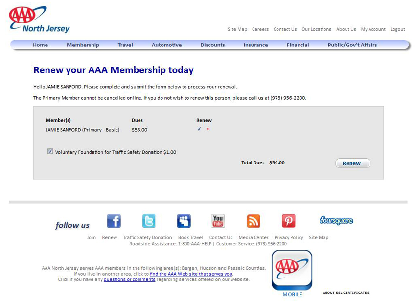 This is the last page I saw. I clicked the button to “renew” my membership and NOWHERE on this page does it offer me the opportunity to upgrade my membership for the new membership period! A huge missed opportunity by AAA. I wanted to pay them more money for an increased service level, and their website completely fails at making that possible.
AAA is lucky that I like their service so much. I actually filled out a form and wrote a check and used a stamp to send this in the actual mail, since their website did not do the job.
I cannot end this post on anything but a down note. Consumers are used to being able to do most things online, and how many opportunities has AAA missed for upgraded memberships because their website is impossible? It would have taken seconds for me to stay with my basic membership and move on, but I made the effort because it was important to me to upgrade. If I was wavering at all I would have just used this website to renew and that would have been the end of it.
Thumbs down, unfortunately. This is not only a frustrating experience on the consumer end, but is likely having an effect on sales and income on the business side. Thumbs down all around.

