 Click here for all posts in the Brand Experience Project.
I’ve become more acquainted with Wayfair since purchasing a house last year. Recently, I was drawn in by an email promising me deep discounts on area rugs.
It worked and within minutes, my husband and I had chosen a rug for the living room and I started the checkout process.
It wasn’t long before I got to entering my payment information. You’ll understand my surprise at seeing this choice of font in the space for me to choose the expiration dates for my credit card.

What is even happening. Every other font on their website is clear and easy to read. Why isn’t the font shown elsewhere in this screenshot also in these dropdown menus?
I was shocked by this and immediately took this screenshot.
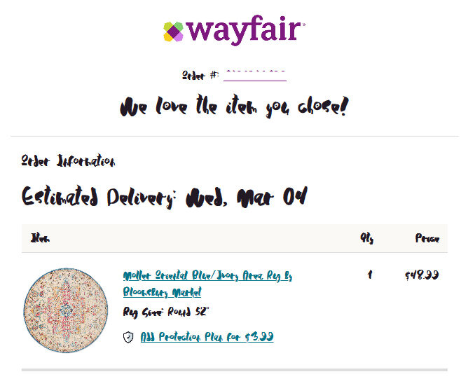
Then I got my confirmation email…

It is unreadable. I work in e-commerce for a store that isn’t even close to being as big as Wayfair, and I find myself feeling lots of sympathy for what HAS to be a mistake. It is a mistake, right?
I don’t know if it is possible that my browser is using this font as a replacement for another one, I almost hope so, but still, this is massively frustrating.
I’ll be sure to send a tweet to Wayfair about this – and hope that someone else has already noticed this issue.
UPDATE – They might have had someone else already report this issue, as my shipping email looked much better! I hope this means that they got the news that the other font was a mess.